Superbia
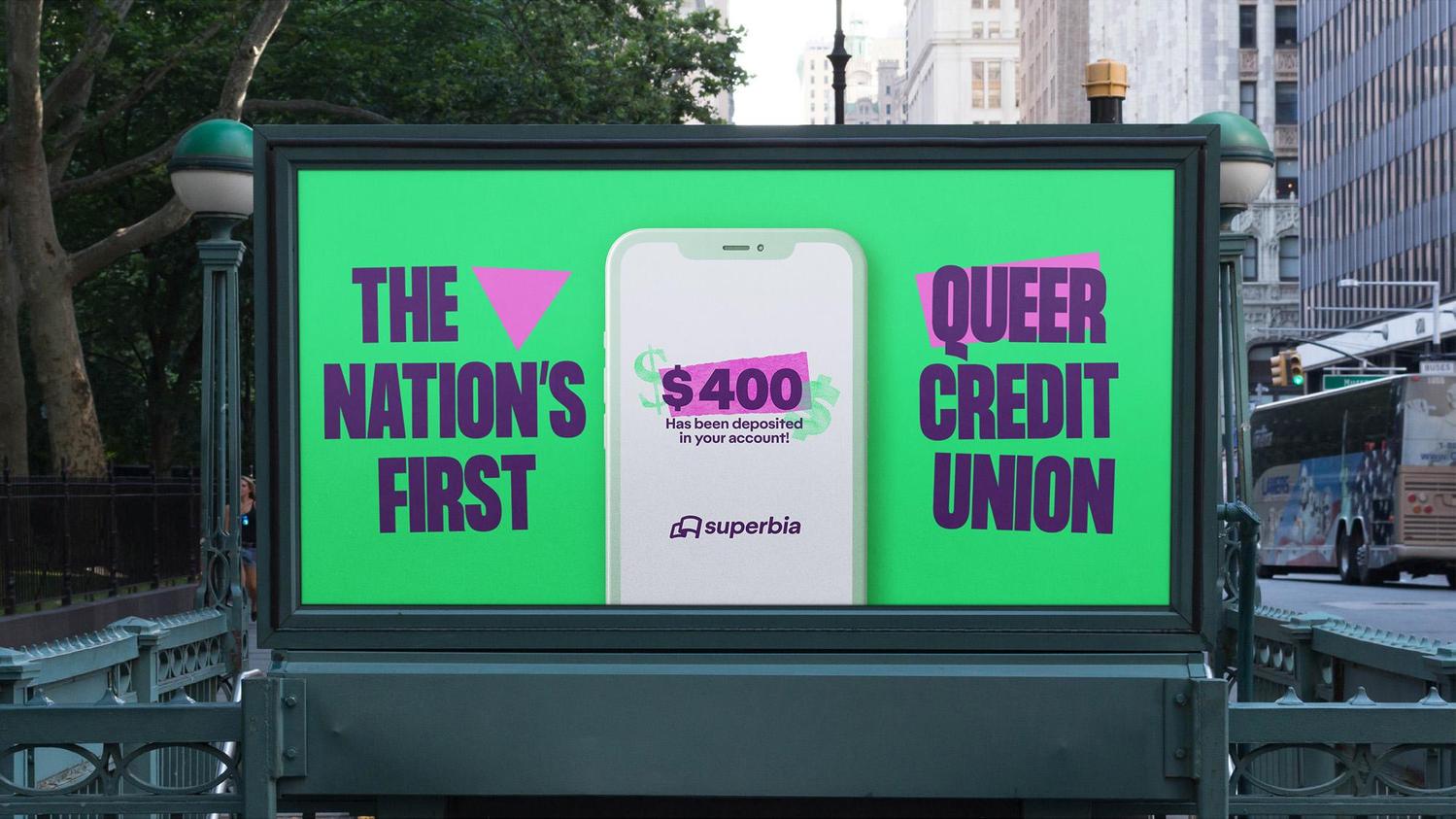
Superbia is the nation’s first LGBTQ focused credit union. Its founder set out to make a financial institution that had inclusivity and equity as it foundational elements. When I was brought on to this project my goal was to create a branding system that didn’t rely on typical tropes or overused rainbow color palettes - signifiers that I believe have lost much of their power and meaning. Instead, I wanted to evoke the DIY punk aesthetics of the early queer rights movement - when marginalized people had to rely on markets, collages, and low quality scanners to create media for their own developing community. Superbia is a bank, and therefore must project competence and professionalism in some way or another. But a bank for queer people should flip the script of finance on its head, challenge expectations and conventions, and celebrate the state of queerness - of not fitting in. My work for Superbia won in the STA 100 awards.
Client
Superbia Credit Union
DELIVERABLES
Art Direction Branding Copywriting Logo Design Motion
Year
Role
Lead Designer


